Tramari Matt Kleberg edition
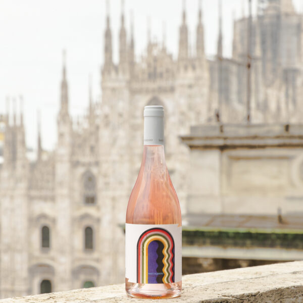
For the second year running, Tramari Rosé di Primitivo San Marzano has become a painter’s canvas.
Adding his signature to this new Limited Edition is the emerging American artist Matt Kleberg, who has interpreted the versatility of the Tramari label with his own style.
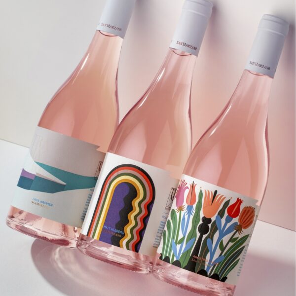
Matt Kleberg’s Tramari is the second chapter of TramArt, a San Marzano project that aims to be a vehicle for art and beauty and to promote the spontaneous union that exists between art and wine, illustrating this union in its various expressions.
Homage to the figurative arts, to the simplicity of style, but also to the emotional charge behind the process of creating something beautiful to share with the world, values that have inspired San Marzano’s philosophy.
An encounter between San Marzano and Matt Kleberg
The collaboration between San Marzano and the American painter, facilitated by gallery owner Angelo Milano (STUDIOCROMIE – Grottaglie TA), arose from an observation of the artist’s works, which, seemingly linear, simple and abstract, are in reality charged with tensions, meanings and references to reality.
The colour palette and the strong tones used evoke images of the earth, the expanses of fields, the clear skies in fine weather and the tufa walls of rural buildings typical of Salento.

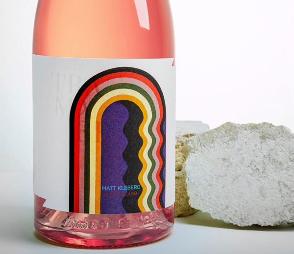
But, in addition to the colours, the depth of space evoked by the work chosen for this collaboration – but also by the artist’s various works in general – is for us representative of the natural landscape, which is difficult to capture through photography. The sensations, instead, come only through direct perception, as when one looks at a work of art in person.
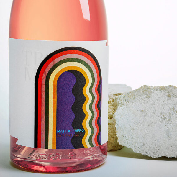
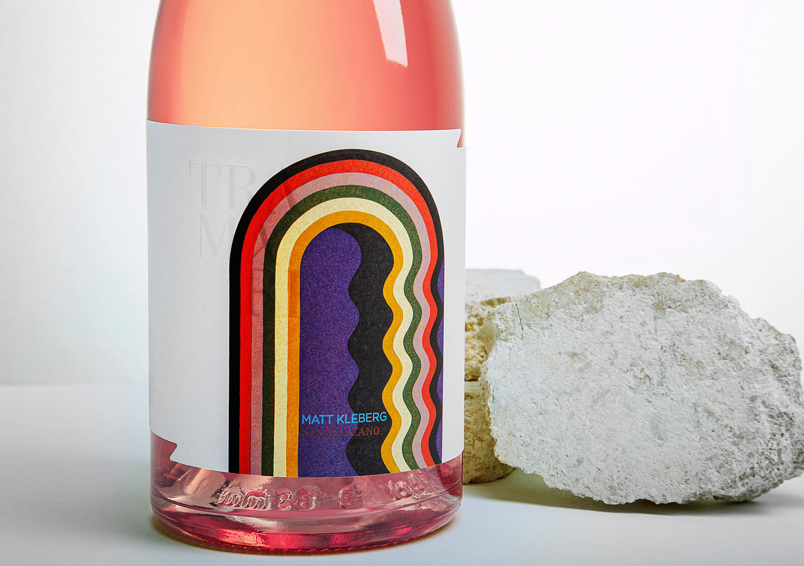
And if in Tramari Paul Kremer (chapter 1 of TramArt) the painting followed the sinuosity of the bottle and the colour of the wine, in Tramari Matt Kleberg the painting emerges from the label, standing out like an imposing arch, inviting us as if into another dimension, into other scenarios, or, depending on one’s sensibility, to decorate in a mannerist manner.
An encounter between San Marzano and Matt Kleberg
The collaboration between San Marzano and the American painter, facilitated by gallery owner Angelo Milano (STUDIOCROMIE – Grottaglie TA), arose from an observation of the artist’s works, which, seemingly linear, simple and abstract, are in reality charged with tensions, meanings and references to reality.
The colour palette and the strong tones used evoke images of the earth, the expanses of fields, the clear skies in fine weather and the tufa walls of rural buildings typical of Salento.
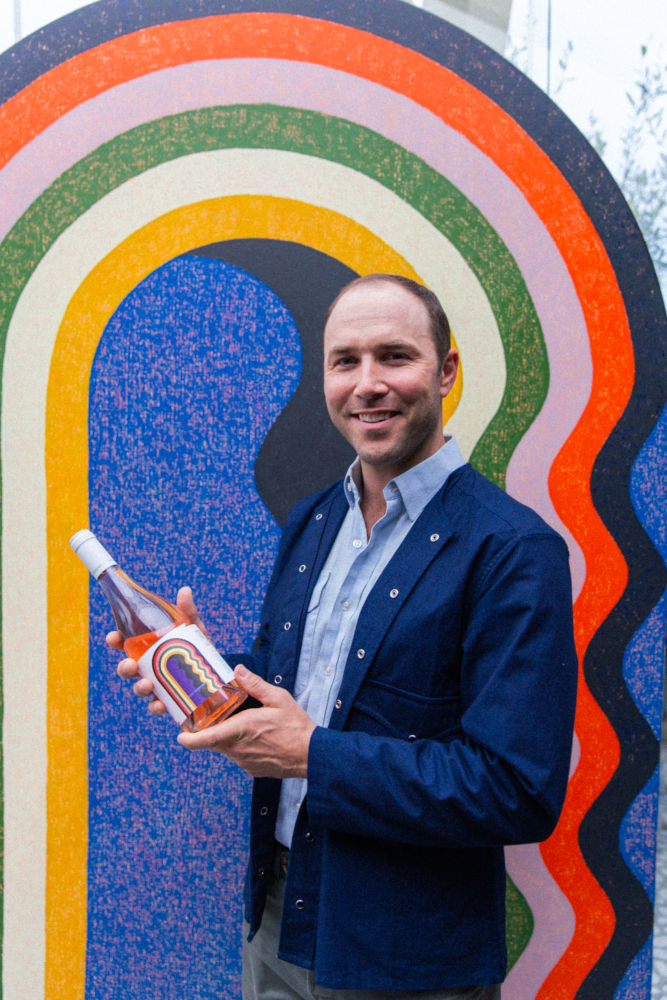
But, in addition to the colours, the depth of space evoked by the work chosen for this collaboration – but also by the artist’s various works in general – is for us representative of the natural landscape, which is difficult to capture through photography. The sensations, instead, come only through direct perception, as when one looks at a work of art in person.
And if in Tramari Paul Kremer (chapter 1 of TramArt) the painting followed the sinuosity of the bottle and the colour of the wine, in Tramari Matt Kleberg the painting emerges from the label, standing out like an imposing arch, inviting us as if into another dimension, into other scenarios, or, depending on one’s sensibility, to decorate in a mannerist manner.
The artist
Matt Kleberg, born in Texas in 1985, is best known for his paintings characterised by abstract, undulating geometric shapes such as arches, stripes, concentric frames that recall architectural elements, a central theme from his New York period onwards, influenced by the buildings of the Big Apple but with references to the Byzantine and Renaissance periods.
An artistic journey that began with his realistic depiction of the Texan landscape in bright earthy colours, before gradually becoming more abstract, shifting to the emptying of forms in favour of the evocation of spaces, passages, even interpreted in the opposite way as barriers and walls, metaphors for the difficulties of real life.
He currently lives in San Antonio – Texas – with his family and has exhibited in several American and European cities including New York, San Francisco, Houston, Detroit, Brussels and Amsterdam.
Collaborations
The paper: Fedrigoni Self-Adhesives
Supporting the project is a collaboration with the Fedrigoni paper group.
Fedrigoni Self-Adhesives is the result of the union of Arconvert, Ritrama and Manter and encapsulates the art of luxury labelling in its wide range of self-adhesive materials, characterised by refined textures and high technical performance.
Thanks to its synergy with Fedrigoni Paper, its many years of experience in wine label design and collaboration with designers, Fedrigoni Self-Adhesives elevates creativity by providing premium materials, as in the case of the Tramari Matt Kleberg edition, where art and expertise come together in a single design. Here, Tintoretto Gesso H+O Ultra WS FSC™ paper becomes both canvas and artwork at the same time, thanks to its material texture and technical performance.
A bottle of wine undergoes an arduous journey before it reaches the table. The right label changes everything, providing it remains impeccable, in appearance and performance, during every stage of its journey, as in this case thanks to the H+Opacity™ and Ultra Wet Strength technologies that guarantee excellent performance even in the event of temperature changes and humidity.
Printing the label: Tonutti Tecniche Grafiche
Tonutti Tecniche Grafiche Spa, a nationwide leader in the printing of premium labels for over 75 years, was involved in printing the labels. ‘The second chapter of TramArt that we have had the honour of printing’, says Maria Teresa Tonutti CEO, ‘once again gave us the opportunity to find the perfect balance between creativity and technique, maximising the aesthetic aspect of the label while making it industrially replicable. The offset printing of the background is enhanced by elegant embossing on the door frame and the curved black inner line, giving the arch a realistic three-dimensional appearance. The iconic entrance almost seems to come out of the canvas, inviting the viewer to enter a mysterious world. The bronze foil of the logo, replicated on the portal, lends elegance and contrasts with the artist’s name embossed in a light blue pantone. The same logo is displayed on the image with a thick matt varnish, creating a wonderful “see-through” effect’. Tramart: a perfect combination of technique and creativity.

